Featured image of post Charts in SwiftUI

Charts in SwiftUI

Dicover how to create charts in SwiftUI with step-by-step guidance.

Introduction

We will explore how to create charts in SwiftUI. Charts are a great way to visualize data in a user-friendly manner. SwiftUI provides a simple and efficient way to create charts in your iOS apps. Let’s get started!

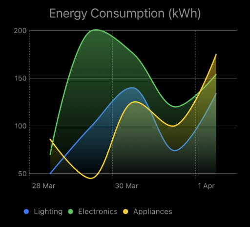
We will build a simple SwiftUI app that displays a line chart using the Charts framework. The line chart will show the energy consumption of a household over a week: Line Chart

Prerequisites

  • iOS 16.0 or later: Ensure you have the latest version of iOS installed on your device.

Steps to Create Charts in SwiftUI

Create a New SwiftUI View

The first step involves creating a new SwiftUI view file named CustomChartView.swift within your project. This file will house the code responsible for rendering the line chart.

Importing Necessary Frameworks

Within CustomChartView.swift, import the required frameworks:

1
2
import SwiftUI
import Charts

The SwiftUI framework provides the foundation for building our SwiftUI app interface. The Charts framework, specifically, offers the tools for creating and customizing our chart.

Defining Sample Data

To create the line chart, we need some data to represent energy consumption. Here’s an example of how to define an array of data points:

 1
 2
 3
 4
 5
 6
 7
 8
 9
10
11
12
13
14
15
16
17
18
19
20
21
22
23
24
25
26
27
28
29
30
31
struct CharData: Identifiable {
  let id = UUID()
  var label: String
  var color: Color
  var date: Date
  var value: Double
  
  static let sampleData: [CharData] = [
    CharData(label: "Lighting", color: .blue, date: mockDate(0), value: 50),
    CharData(label: "Lighting", color: .blue, date: mockDate(1), value: 100),
    CharData(label: "Lighting", color: .blue, date: mockDate(2), value: 140),
    CharData(label: "Lighting", color: .blue, date: mockDate(3), value: 74),
    CharData(label: "Lighting", color: .blue, date: mockDate(4), value: 134),
    
    CharData(label: "Electronics", color: .green, date: mockDate(0), value: 70),
    CharData(label: "Electronics", color: .green, date: mockDate(1), value: 200),
    CharData(label: "Electronics", color: .green, date: mockDate(2), value: 176),
    CharData(label: "Electronics", color: .green, date: mockDate(3), value: 120),
    CharData(label: "Electronics", color: .green, date: mockDate(4), value: 154),
    
    CharData(label: "Appliances", color: .yellow, date: mockDate(0), value: 86),
    CharData(label: "Appliances", color: .yellow, date: mockDate(1), value: 45),
    CharData(label: "Appliances", color: .yellow, date: mockDate(2), value: 125),
    CharData(label: "Appliances", color: .yellow, date: mockDate(3), value: 100),
    CharData(label: "Appliances", color: .yellow, date: mockDate(4), value: 175),
  ]
  
  static func mockDate(_ date: Int) -> Date {
    Calendar.current.date(byAdding: .day, value: date, to: .now) ?? Date()
  }
}

This code defines a struct named CharData that holds information about each data point, including the day and the corresponding energy consumption value. We then create a sample dataset named sampleData as an array of CharData structs, representing the energy consumption for each day of the week.

Creating the Line Chart

Next, we’ll create the line chart using the LineChart view from the Charts framework. Here’s an example of how to define the line chart view:

  1
  2
  3
  4
  5
  6
  7
  8
  9
 10
 11
 12
 13
 14
 15
 16
 17
 18
 19
 20
 21
 22
 23
 24
 25
 26
 27
 28
 29
 30
 31
 32
 33
 34
 35
 36
 37
 38
 39
 40
 41
 42
 43
 44
 45
 46
 47
 48
 49
 50
 51
 52
 53
 54
 55
 56
 57
 58
 59
 60
 61
 62
 63
 64
 65
 66
 67
 68
 69
 70
 71
 72
 73
 74
 75
 76
 77
 78
 79
 80
 81
 82
 83
 84
 85
 86
 87
 88
 89
 90
 91
 92
 93
 94
 95
 96
 97
 98
 99
100
101
102
struct CustomChartView: View {
  @State private var title: String
  @State private var data: [CharData]
  private let isShowLegend: Bool
  private let yMin: Double
  private let yMax: Double
  
  init(
    title: String,
    data: [CharData],
    isShowLegend: Bool = true
  ) {
    self.title = title
    self.data = data
    self.isShowLegend = isShowLegend
    self.yMin = data.map(\.value).min() ?? 0
    self.yMax = data.map(\.value).max() ?? 0
  }
  
  var body: some View {
    VStack {
      Text(title)
        .font(.title3)
        .foregroundStyle(.gray)
      
      chartView
    }
    .padding(.horizontal, 20)
  }
}

// MARK: - Chart
private extension CustomChartView {
  var chartView: some View {
    Chart(data, id: \.id) {
      LineMark(
        x: .value("Time", $0.date, unit: .day),
        y: .value("Value", $0.value),
        series: .value("Series", $0.label)
      )
      .foregroundStyle($0.color)
      .foregroundStyle(by: .value("Series", $0.label))
      .interpolationMethod(.catmullRom)
      
      AreaMark(
        x: .value("Time", $0.date, unit: .day),
        yStart: .value("Min", data.map(\.value).min()!),
        yEnd: .value("Value", $0.value),
        series: .value("Series", $0.label)
      )
      .foregroundStyle(LinearGradient(
        colors: [$0.color.opacity(0.5), .clear],
        startPoint: .top,
        endPoint: .bottom
      ))
      .interpolationMethod(.catmullRom)
    }
    .chartXAxis {
      AxisMarks() {
        AxisValueLabel()
          .foregroundStyle(.gray)
        AxisGridLine()
          .foregroundStyle(.gray)
      }
    }
    .chartYScale(domain: yMin...yMax)
    .chartYAxis {
      AxisMarks(position: .leading) {
        AxisValueLabel()
          .foregroundStyle(.gray)
        AxisGridLine()
          .foregroundStyle(.gray)
      }
    }
    .chartLegend {
      legendsView
    }
  }
  
  @ViewBuilder
  var legendsView: some View {
    if isShowLegend {
      ScrollView(.horizontal) {
        HStack {
          let colors = data.reduce(into: [String:Color](), { $0[$1.label] = $1.color }).map { ($0.key, $0.value) }
          ForEach(Array(colors), id: \.0) { data in
            HStack {
              BasicChartSymbolShape.circle
                .foregroundColor(data.1)
                .frame(width: 8, height: 8)
              Text(data.0)
                .foregroundColor(.gray)
                .font(.caption)
            }
          }
        }
        .padding()
      }
      .scrollIndicators(.never)
    }
  }
}

Conclusion

This blog post has provided a foundational understanding of creating charts in SwiftUI using the Charts framework. We built a simple line chart to visualize sample energy consumption data

References

comments powered by Disqus
Built with Hugo
Theme Stack designed by Jimmy